Full Width Design in EverWeb 1.8
My favourite new feature that was introduced in version 1.8 of EverWeb is the ability to make your site have full width design. In my opinion, this is taking the current sites that EverWeb users are producing and bringing them from a 90’s look and feel, right up to the standards of a modern website in 2015.
The old look of a website with a browser background that is a solid color or tileable pattern has seemed to become outdated. EverWeb now makes it very easy for people to begin taking their websites to the next level with a full width design.
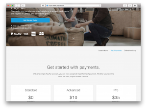
If you are not sure what I am referring to when I mention full width design, a good example is the PayPal website. Here is a screenshot below.
 Notice the image that spans the entire width of the browser. As well, the background for the pricing chart also spans the entire width of the browser. This is now possible to do in EverWeb.
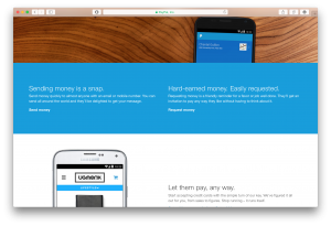
Here is another example of what can be done, also from the PayPal website:
 Notice the blue background that spans the width of the browser. This will continue to be the case even if the user widens the browser.
If you are interested in learning exactly how to accomplish this in EverWeb, check out the video tutorial that the EverWeb guys have posted.
Have you had a chance to create a full width design in EverWeb? Post your URL below and share!


