How to Build A Responsive Website On Your Mac

A responsive website lets you build one website that works on all devices, for all users, no matter what browser, phone, computer etc… they use to visit your website. Basically, there will never be a horizontal scrollbar.
The advantage of a responsive website is that they work for all users without having to redesign your website for each device.
The disadvantage is that they are a little more complicated to create and take some time to test on all the different devices that visitors use to visit your website.
Many different website builders exist to create websites, both responsive and regular websites. The main problem is understanding how to properly build your responsive website so that it just works.
One Trick to Building Proper Responsive Websites
The main trick to designing a responsive website is;
Keep it simple!
This means you don’t want to be adding too many complex design ideas to your website.
Think of your website as a vertical stack of sections such us;
HEADER
MAIN IMAGE WITH SMALL DESCRIPTION
BRIEF DESCRIPTION OF WEBSITE
CUSTOMER TESTIMONIALS
FOOTER
So, each part of your website lines up vertically, stack on each other instead of a column based design you might see in older based websites.
What is a Responsive Website Video Tutorial
How to Build a Responsive Website
Normally, building a responsive website would be planning out how you want the website to appear on mobile, tablets and desktop computers. This is done by setting markers, known as breakpoints at the common width of a mobile device, table and desktop computer.
This process can of course get tedious.
A much easier way to do this is to follow the above format of designing a responsive website, sections stacked on each other.
When a section contains too much horizontal content, the content is wrapped to the next line, increasing the length of the browser page.
With EverWeb’s Responsive Web Design layout, this is all taken care of for you.
Creating & Understanding Responsive Website Design
With EverWeb, we can add a new Responsive page. There are many templates to choose from (or you can start from a completely blank page).
Click the ‘Add Page’ button in the toolbar and choose your template. We will choose the Home page for the Client template.
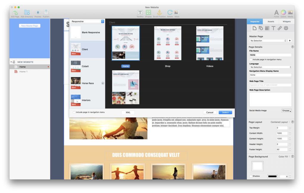
Add A Responsive Web Page to Your Website using the Add Page button in EverWeb’s toolbar.
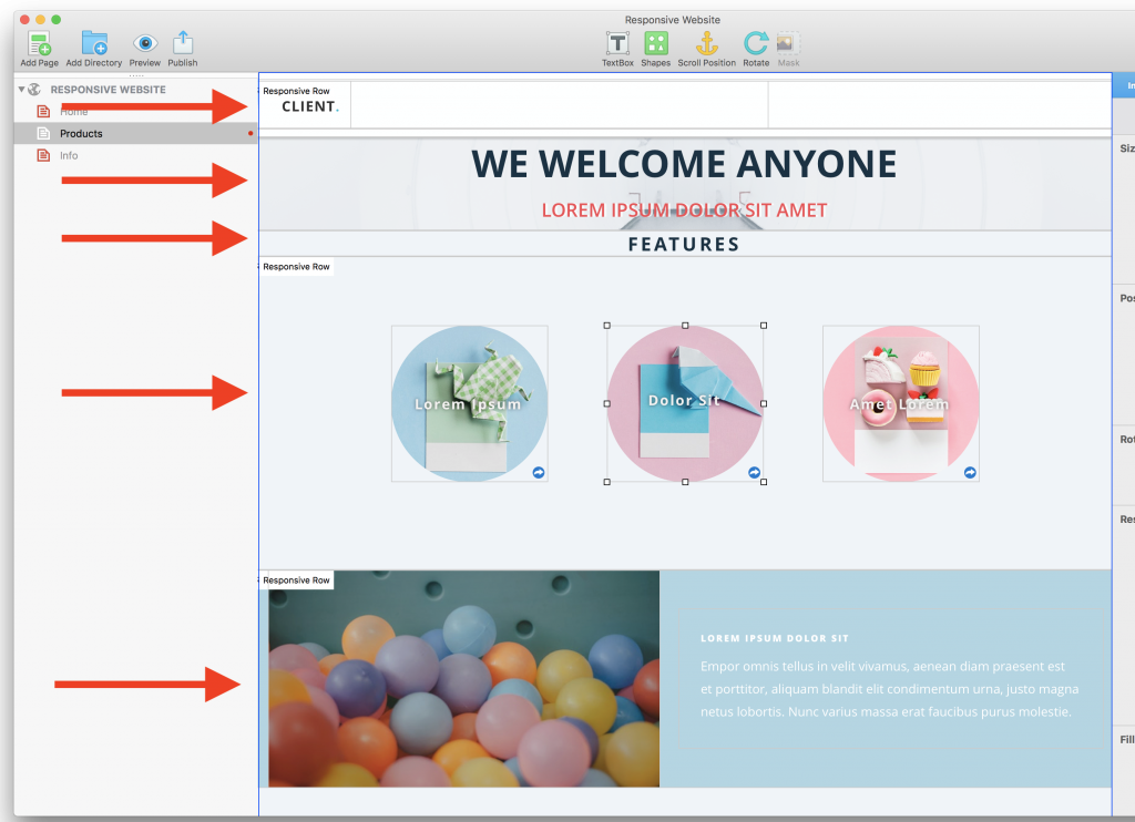
Once added to your website you will see that each part of your website is broken up into sections which are stacked horizontally, as described above in this tutorial.
If we wanted to, we could re-arrange each section by dragging them up or down on our website. But before we do that. let’s see what happens when we resize our window.
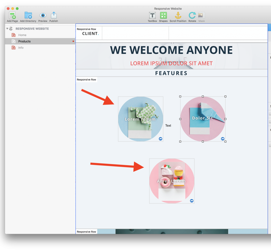
Desktop Layout for a Responsive Webpage
As we resize our window, the objects within each row are wrapped to the next section so that they fit within our window without scrolling horizontally.
That is, essentially, a responsive website. It responds by re-arranging its design to the width of the web browser.
This is a very simply example, and with EverWeb’s new responsive widgets, you can set even more advanced customizations, such as making an image or text expand to the browser window width.
For now, let’s make sure that the basic concept of designing a responsive website is covered.
Smaller Width Responsive Page
So how is this responsive behavior achieved so easily?
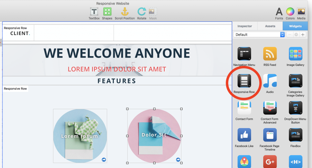
EverWeb’s Responsive Row Widget
The new Responsive Row widget, which can be found under the Widgets tab, lets you group elements that are wrapped to the next line as the browser width gets smaller.
From the screenshot below you can see the Responsive Row widget that we can drag onto your web page, just like any other widgets.
Once we drop the Responsive Row widget on our website it looks like this and allows us to now drag and drop any element into it, such as images, text, or any other widget.
And as we learned above, EverWeb will automatically adjust the content so that they fit nicely within our web browser, no matter what the width is. There will be no horizontal scrolling on any device.
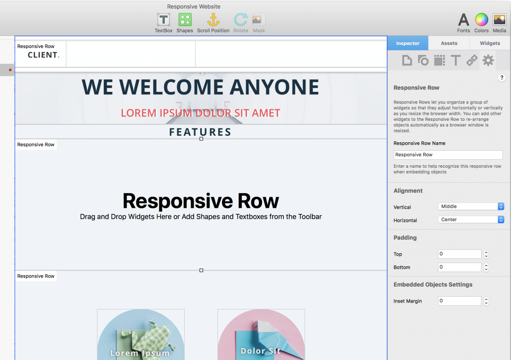
Our settings under the Widget settings let us give;
- Give the Responsive Row a name so that we can easily identify it. This is useful when you want to embed existing objects on your page in a Responsive Row. You can right click on any other element and select ‘Embed in <Responsive Row Name>’
- The alignment lets us align each object vertically and horizontally. Generally the default settings of Middle and Center will be the desired behavior.
- Padding lets us add some spacing at the top and bottom of the Responsive Row to space out our stacked sections as we like
- Inset Margin defines a spacing around each object within the Responsive Row so that they can be spaced out nicely
Some Advanced Responsive Row Tips
The Responsive Row has some other very nice features.
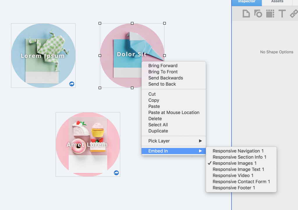
- As mentioned, we can embed any existing object in a Responsive Row by right clicking on it and selecting ‘Embed In’ and then selecting the Responsive Row
- All of the Fill Shape options under Inspector->Shape Options->Fill work with the Responsive Row and work properly on responsive websites. That means you can make nice gradients that load quickly or even use the image fill options to add responsive hero images
- You can use the full width margin settings under Inspector->Metrics tab to adjust the left and right margins if you don’t want the Responsive Row to take up the entire width of the browser
More Advanced Responsive Website Tricks
The official step by step video tutorial for the Responsive Row Widget can be seen below. It walks you through using the Responsive Row on a Responsive EverWeb Website.
In addition, the Video, Audio, Youtube and Vimeo widgets let you add responsive Videos and Images to your website that will adjust their aspect ratio properly for your responsive website.
If you are looking for even more flexibility and design control, the new FlexBox widget will provide you with even more options for creating awesome responsive websites in EverWeb. We’ll cover that in the next tutorial.
I hope you have enjoyed this tutorial. If you have any questions, please post them below.


